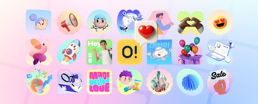
If your team needs clean, consistent visuals without detouring into a week of “let’s tweak the style guide again,” Ouch is the sane middle ground. It’s a curated illustration library with vector, 3D, and animated assets you can drop into interfaces, campaigns, decks, and courseware—then refine without leaving your toolchain. Here’s how it actually helps each role ship faster without wrecking quality.
What you get in the box
Formats and breadth. Ouch includes static vectors (SVG/PNG), 3D renders, and animated assets. Collections are organized by styles and categories and exposed as ready-to-use PNG/SVG/GIF, with editing hooks to adjust colors or recombine parts before download.
Real animation formats. Beyond GIFs, Ouch highlights modern motion pipelines—Lottie JSON, Rive, After Effects sources, and even MOV for some 3D sets—so you can keep animations crisp and lightweight in apps and on the web.
A deep style system. Styles aren’t random. Each set is internally consistent so UI states, landing graphics, and social cuts match without manual repainting. The catalog spans “Animated,” “3D,” “Trendy,” “One tone,” “Characters,” and more—hundreds of styles with thousands of pieces.
Workflow integrations that actually shave hours
Figma, right in the canvas. Icons8’s Figma plugin surfaces a huge cross-library catalog (icons, illustrations, photos) directly in Figma. The plugin page reports ~920k users, a decent proxy that this is battle-tested in real teams. Install once, search, drag, done.
Pichon desktop app (Mac/Windows). Prefer a native palette? Pichon pulls the same illustration catalog into a lightweight app with drag-and-drop into Sketch, Figma, Photoshop, and friends—handy for offline stashes or when your browser tabs are already screaming.
Edit/mix before download. Too often “library” means “take it or leave it.” Ouch ties into Mega Creator so you can recolor, regroup parts, or assemble composites in the browser, then export exactly what the design needs.
For developers: there’s an API. The Ouch API lets you search by query, style, category, and filter by format (PNG/SVG); you can request high-res versions programmatically. That means you can build internal pickers, pre-seed marketing templates, or auto-generate onboarding illustrations per locale—no manual downloading.
Performance and accessibility: the non-negotiables
Pick SVG when it’s truly vector. For UI states, diagrams, empty states, and logos, SVG is the preferred choice—it scales sharply and is usually smaller than raster for simple geometry. Use PNG when you need pixel art, textures, or complex gradients that won’t translate.
Animation formats with intent. If you need motion in your app, Lottie keeps file sizes lean and remains editable; Rive is gaining traction for interactive micro-animations; GIF is a lowest-common-denominator fallback but heavier. Ouch gives you options instead of locking you into a legacy format.
Color and contrast. Recoloring SVGs is trivial, but don’t ship unreadable UI. Align fills and backgrounds with WCAG 2.2: text contrast ≥ 4.5:1 (AA) and large text ≥ 3:1; UI components should meet 3:1 for non-text elements. It’s boring but it’s how you avoid support tickets.
Licensing and cost (so legal doesn’t chase you)
The model is straightforward:
- Free with attribution. Use the graphics for free if you link back to Icons8, which can live in the footer if assets appear site-wide.
- No-attribution, editable, and high-res via paid plans. PNGs are free with a link, while subscriptions unlock editable formats and remove attribution requirements. Pricing starts from $0.5 per illustration if you’re buying à la carte.
If you’re building this into a product, document the attribution rule or your paid plan in your repo’s brand-assets.md. Future-you will thank present-you.
How Ouch fits each team’s real work
Web designers & UI/UX specialists
- Empty states, onboarding, and feature walkthroughs benefit from consistent sets so screens feel like one product—not a collage from five different stock sites. The style taxonomy makes it easy to find a coherent family, then expand later without re-art-directing.
- In-tool edits (recoloring, swapping parts) mean you can pair visuals with design tokens—primary, success, warning—fast.
- Animation without pain. Start with a static state, upgrade to Lottie during polish; the assets are already in compatible formats.
- UX due diligence. Ouch won’t do your research, but it won’t fight it either. Treat illustrations as hypotheses; validate with lightweight UX methods (A/Bs, concept tests) mapped to your phase of work.
Marketers & SMM managers
- Campaign speed. Need six visual variants for A/B testing by lunch? Pick one style and spin out a family of assets sized for feed, story, and blog hero. Motion options give you lightweight loops for social without a motion designer on call.
- Topic depth. Collections cover verticals and concepts—education, technology, healthcare, product screenshots, etc.—so you’re not forcing a generic doodle onto a technical topic. If you’re producing science explainers, start with curated science clipart, then recolor to match brand swatches.
- Brand consistency at scale. One style for lifecycle emails, a sister style for product updates, and a 3D set for one-off launches—coordinated but not monotonous.
Developers
- Automate the boring parts. Use the Ouch API to pull tagged illustrations into CMS templates or generate local caches by style and locale. Filter by mediaFormat=svg to keep payloads lean; request hi-res only where you truly need it.
- Ship responsibly. Prefer SVG for icons/diagrams (crisp and smaller for vector content) and reserve PNG for complex raster art. This keeps Lighthouse happier.
- Plugin ecosystem. When design lives in Figma, the Icons8 plugin lets engineers grab the exact asset designers placed—no “close enough” re-exports.
Educational institutions & educators
- Curriculum visuals. Pick a single style for slides, LMS modules, and handouts. The visual continuity helps learners track concepts across weeks.
- Accessibility first. Ensure your recolors maintain WCAG AA contrast; this matters in classrooms with mixed displays and projectors.
- Motion where it teaches. For process diagrams or lab procedures, Lottie beats GIF for clarity and file size; your LMS will thank you.
Startups & small businesses
- A credible brand look, quickly. Consistent illustrations across the website, product, and pitch deck make you look coordinated without hiring a full-time illustrator.
- Cost control. Start free with attribution, move to a paid plan when you need editable source files or your legal team asks to drop credits. Per-asset pricing remains reasonable when you only need a handful.
Where Ouch 3.0 moved the goalposts
Icons8’s Ouch 3.0 release expanded the library with new styles, 3D packs, animated counterparts for many statics, and Mega Creator integration for flexible edits—plus an improved site UI. If you evaluated Ouch years ago and bounced, it’s a different beast now.
Implementation checklist (steal this)
- Pick 1–2 styles that match your product tone; save a “backup” style for marketing.
- Map colors to tokens and recolor SVGs in Mega Creator to match your design system.
- Decide formats: SVG for UI/diagrams, PNG for complex imagery, Lottie/Rive for motion.
- Document licensing (free with link vs paid/attribution-free) in your repo and CMS authoring docs.
- If you’re at scale, wire up the API for templated pages or internal asset pickers.
- Add contrast checks to your review checklist—especially when recoloring.
- Motion responsibly: start static, then add Lottie where it increases comprehension or affordance.
- Cache assets by style/version in your build to avoid surprise swaps.
- Run quick user checks (concept tests, preference tests) before rolling a new style across the product.
- Centralize exports in Pichon or a shared Figma library so designers/engineers pull the same sources.
Limits and how to mitigate them
- You’ll still need taste. A library isn’t a brand. Choose styles with intention and restrain the palette.
- Overuse risk. Popular sets can feel familiar. Recolor, crop, and compose elements; don’t paste whole scenes verbatim.
- Motion budget. If every block jiggles, nothing communicates. Use Lottie for cues, not decoration.
Bottom line
Ouch is a sensible, well-tooled illustration system for teams that value speed, consistency, and technical hygiene. The library’s breadth (vector/3D/animation), solid integration points (Figma, Pichon, API), and clear licensing paths make it easy to adopt without creating design debt. If you need custom art direction for a flagship campaign, commission it. For everything else you ship weekly—dashboards, onboarding, help centers, product updates—Ouch covers the 80% with fewer meetings and fewer “can you export that again?” pings.